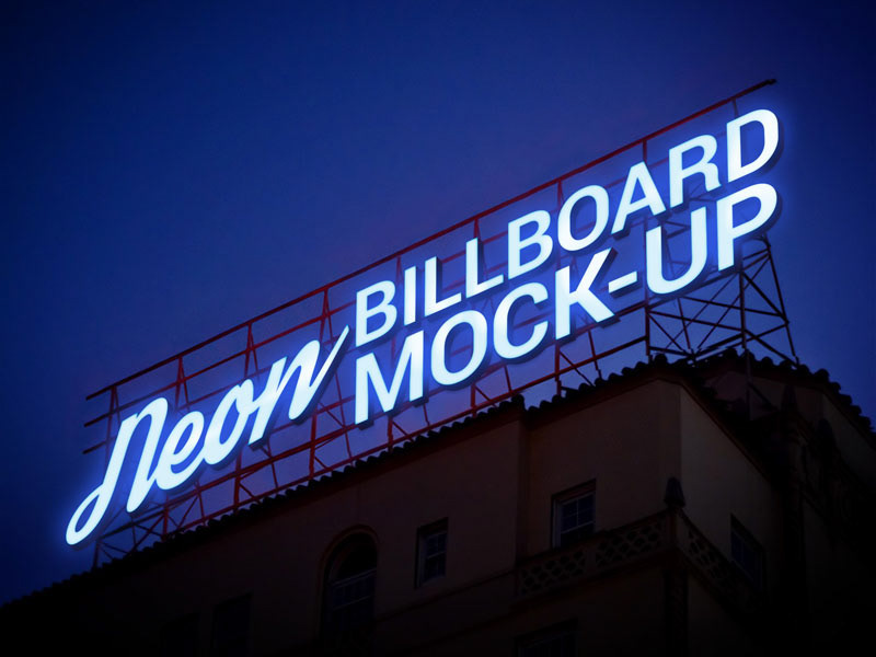

Typography plays a crucial role in the effectiveness of outdoor signage. The font style you choose directly impacts readability, brand perception, and overall visual appeal. In busy commercial environments, where customers only have a few seconds to notice and understand a sign, selecting the right font can determine whether your message is seen or ignored.
Modern illuminated signage gives businesses a wide range of typographic options that can be tailored to different branding needs. A well-designed custom outdoor neon sign relies heavily on font selection to ensure clarity, visibility, and strong brand identity across both daytime and nighttime conditions.
Table of Contents
TogglePrioritizing Readability Over Complexity
The most important factor when choosing a font for outdoor signage is readability. While decorative fonts may look attractive on screens or printed materials, they often lose clarity when scaled up or viewed from a distance.
Simple, clean fonts are more effective because they allow viewers to quickly recognize words without confusion. Sans-serif fonts are commonly used in neon signage due to their straightforward structure and balanced spacing.
In outdoor environments, where attention spans are short, clarity should always take priority over artistic complexity.
Considering Viewing Distance and Environment
Font selection should always account for how far away the audience will be when viewing the sign. A font that works well for close-up viewing may not be suitable for roadside or high-mounted signage.
Thicker strokes and wider letter spacing improve visibility from a distance. This ensures that the message remains legible even when viewed by fast-moving pedestrians or vehicles.
Environmental factors such as lighting conditions, background contrast, and surrounding visual noise should also be considered when selecting typography.
Choosing Fonts That Match Brand Personality
Typography is not just about readability—it also communicates brand identity. Different font styles can evoke different emotions and perceptions.
For example, bold and geometric fonts often convey strength and modernity, while softer rounded fonts may suggest friendliness and approachability. Luxury brands may prefer elegant, minimal fonts that communicate sophistication.
Selecting a font that aligns with brand personality helps reinforce identity and creates a more cohesive customer experience.
Balancing Style With Simplicity
While creativity is important in signage design, overcomplicating typography can reduce effectiveness. Fonts with excessive curves, shadows, or decorative elements may become difficult to read when illuminated.
A balanced approach ensures that the design remains visually appealing without sacrificing clarity. Subtle stylistic touches can enhance branding without overwhelming the viewer.
In neon-style signage, simplicity often results in stronger visual impact and better long-term recognition.
Importance of Letter Spacing and Alignment
Beyond font style, spacing between letters (kerning) and words plays a major role in readability. Poor spacing can make even simple fonts difficult to read, especially when illuminated at night.
Proper alignment ensures that the text appears structured and visually balanced. This is particularly important for longer business names or multi-word phrases.
Well-spaced typography improves both aesthetic quality and functional clarity.
Adapting Fonts for Illumination Effects
Neon-style signage interacts with light in unique ways, which means not all fonts behave the same when illuminated. Thin strokes may become less visible, while overly bold fonts may lose detail.
Choosing fonts with medium thickness and consistent stroke width often produces the best results. These designs ensure that illumination enhances readability rather than distorting the shape of letters.
Testing how a font appears under lighting conditions is an important step in the design process.
Maintaining Consistency Across Branding Materials
Font selection for signage should align with overall brand typography used in logos, websites, and marketing materials. Consistency helps strengthen brand recognition and ensures a unified visual identity.
When customers encounter the same font style across multiple platforms, it reinforces familiarity and trust.
This consistency is especially important for businesses aiming to build long-term brand awareness.
Conclusion
Choosing the right font for outdoor signage is a critical step in creating effective visual communication. Readability, distance visibility, and brand alignment all play important roles in ensuring that the message is clear and impactful.
A thoughtfully designed custom outdoor neon sign uses typography not just as decoration, but as a strategic branding tool. By selecting fonts that balance clarity and personality, businesses can create signage that enhances visibility, strengthens identity, and leaves a lasting impression on their audience.